A look inside our founder’s own House of Lozi
If you imagined our founder would live in a home filled with bespoke Lozi pieces, you’d be absolutely correct. Shared with his wife Barbara and their cat Sucuk, Soroush’s apartment is found within Hide, a development located just a few moment's walk from our Work/Shop.
Hide was completed in 2020 by Shoreditch-based developer Artform in close collaboration with the interior designers at Scenesmith. After purchasing the site a few years earlier, Artform’s managing director Jonathan felt he had the opportunity to create something special; overlooking Haggerston Park with views into Hackney City Farm, this was no ordinary inner-city site. And Scenesmith’s founder Sophie agreed, taking influence from the natural yet urban location. Together, they chose to use local craftspeople and suppliers wherever possible and approached Lozi early on in the project to create the kitchens and wardrobes for all nine apartments. This was Soroush’s first time working with a developer on a larger scale and it’s still our most local project to date.
Scenesmith’s chosen colour palette for the scheme was rich and warm, with exposed plaster walls, terracotta tiled bathrooms and burgundy-flecked flooring. Our cherry wood veneer was the clear choice to complement these finishes, with a white Fenix laminate top to match the sink and appliances.
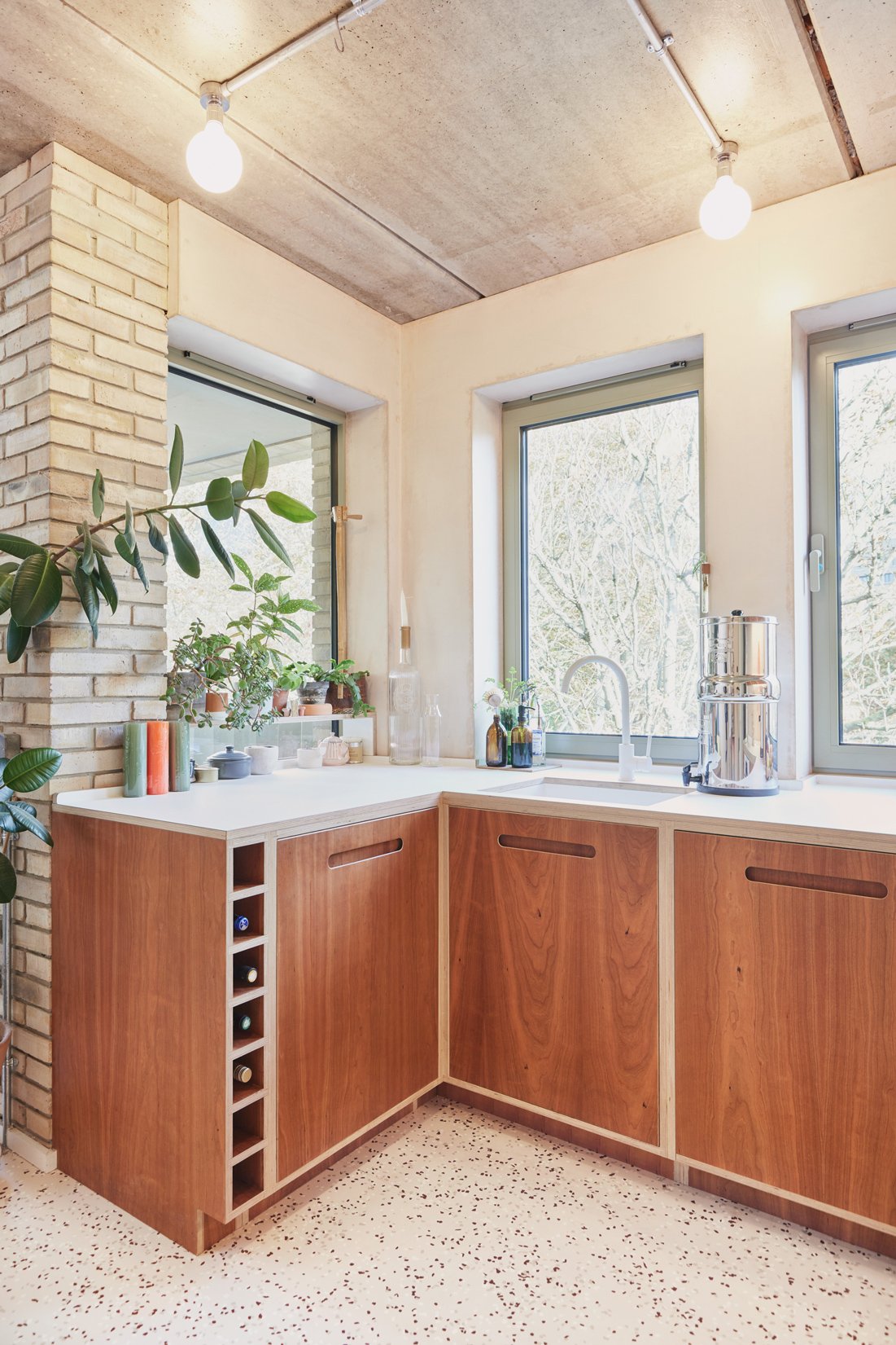


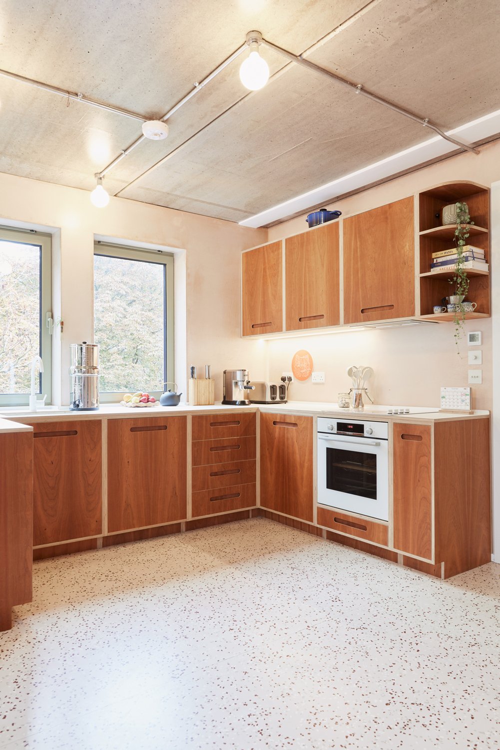
Across numerous meetings with Artform and Scenesmith, curves became a prevalent design detail that could soften the shapes within each space, whether that was with rounded handles or curved open shelving.
However, every kitchen in the development was bespoke to the apartment’s layout. For instance, the worktops in Soroush’s apartment feel especially deep, as we chose to follow the shape of the windows, gaining space from what would normally be window sills. We also worked around the brick pillar - the only apartment in the development to have this internal feature.
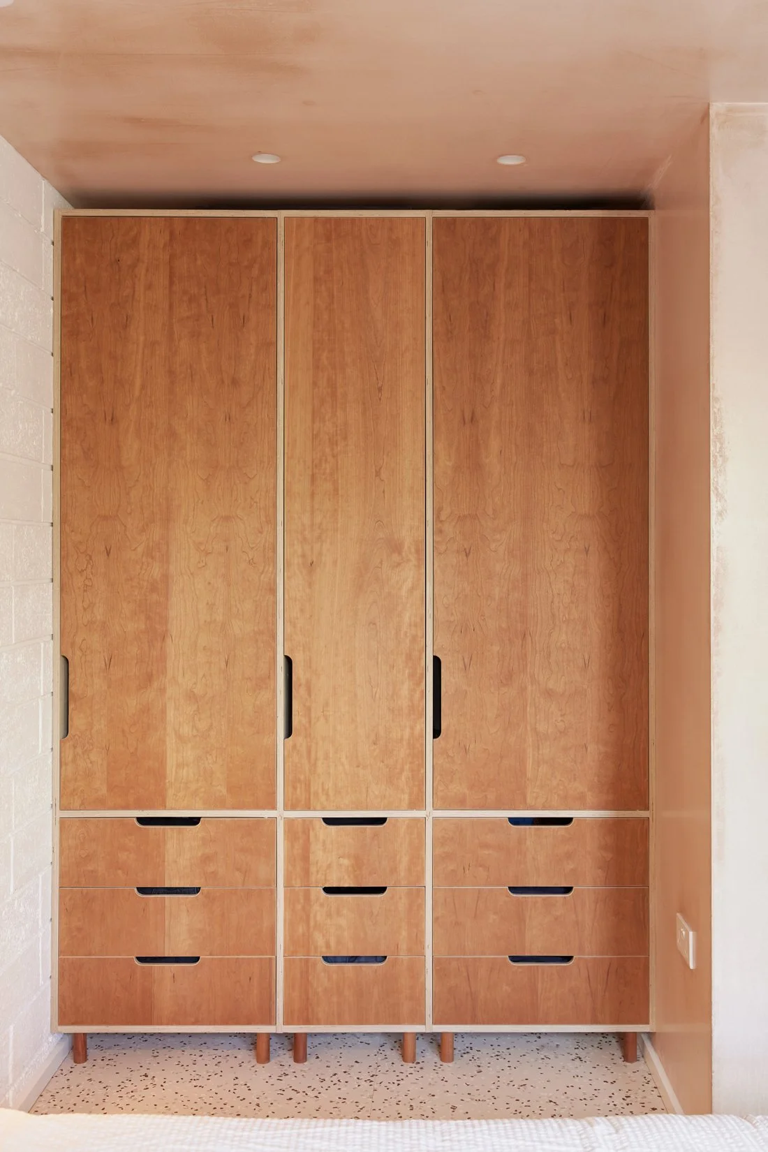
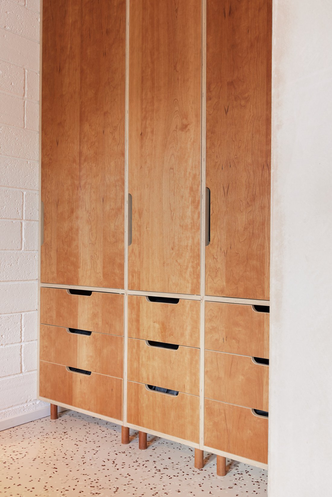
Similarly to the kitchens, each wardrobe was designed bespoke to the apartment and its individual layout. In what would become Soroush’s home, we used a nook within the bedroom to create three hanging spaces with drawers below. Using large pieces of veneer, we were able to include patterns that flow from the base upwards, across each drawer and door. All resting atop solid cherry legs.
During the design and build, Soroush and Barbara hadn’t planned to make one of the Hide apartments their own. But as the project neared completion and Soroush saw the attention to detail that had gone into the development’s build, they chose to take the leap. To live in a new-build House of Lozi project, only a 30-second commute from the Work/Shop, sounded ideal.
After living in the apartment for a few months, and understanding exactly how they used the space, Soroush began designing custom Lozi pieces to fit alongside the kitchen and wardrobes.
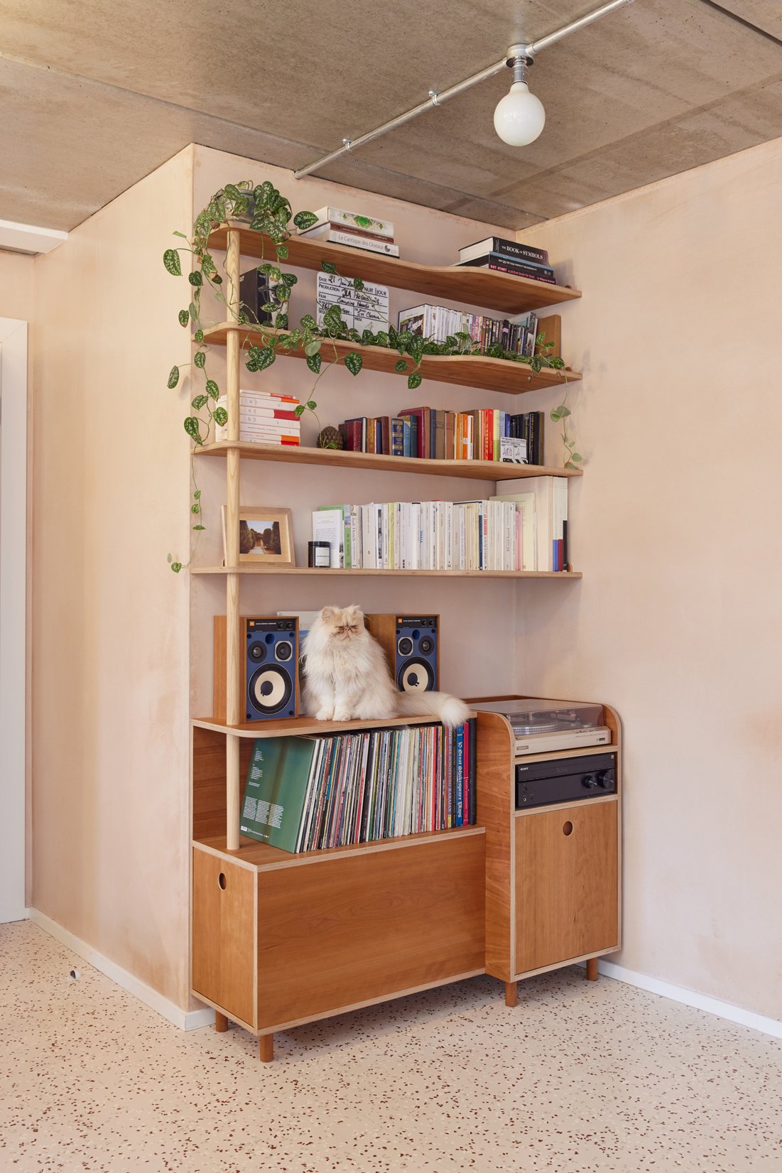
First up was a shelving unit in the dining area to house books, a record player and Soroush’s vinyl collection. He was keen to make use of the room’s height rather than take up precious floor space, and this meant our designs played with depth, based on the differing sizes of each object that would sit on the shelves. At the lower level rests the record player, with a stepped-back section for the vinyl and speakers. Above this, the larger books in Barbara and Soroush’s collection are tucked nicely into the wider corner sections of the shelves. And lastly, their smaller books and trinkets have a spot on the shallower shelves.
This concept removes the bulk from the piece of furniture, working with the space (and each specific object) rather than against it. We’ve since used this idea in numerous different projects, creating pieces that feel as though they’ve always been there.
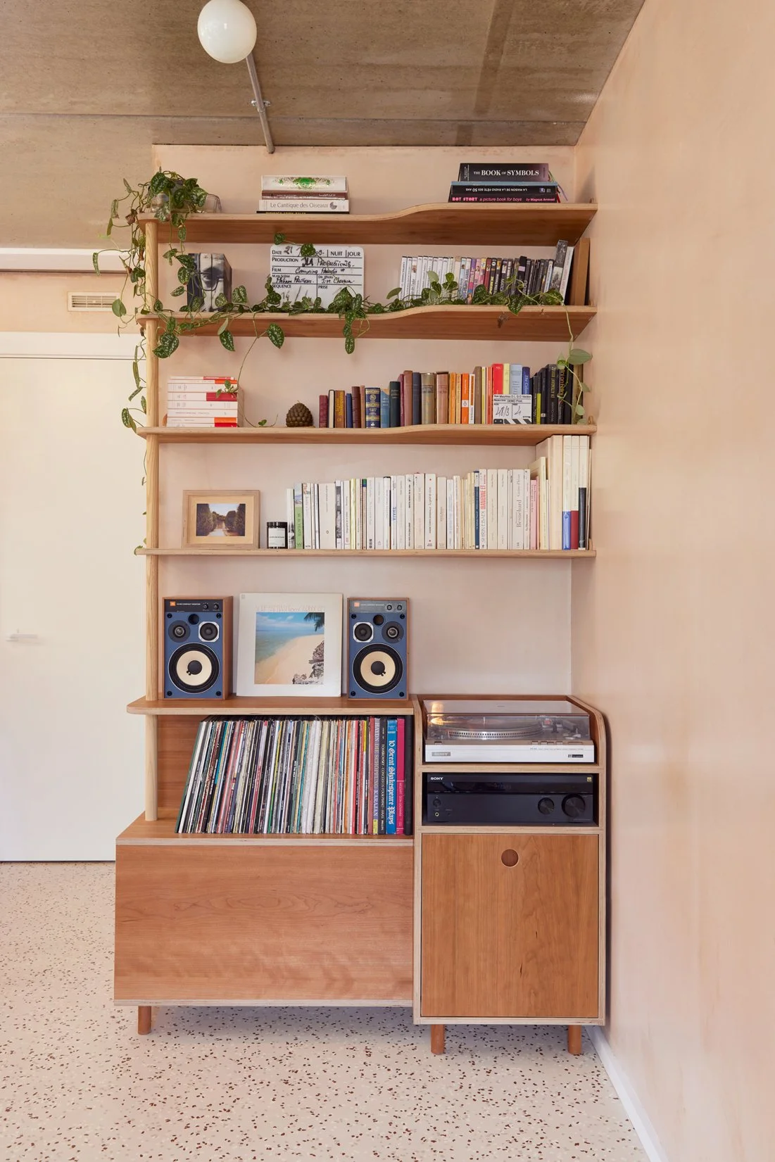
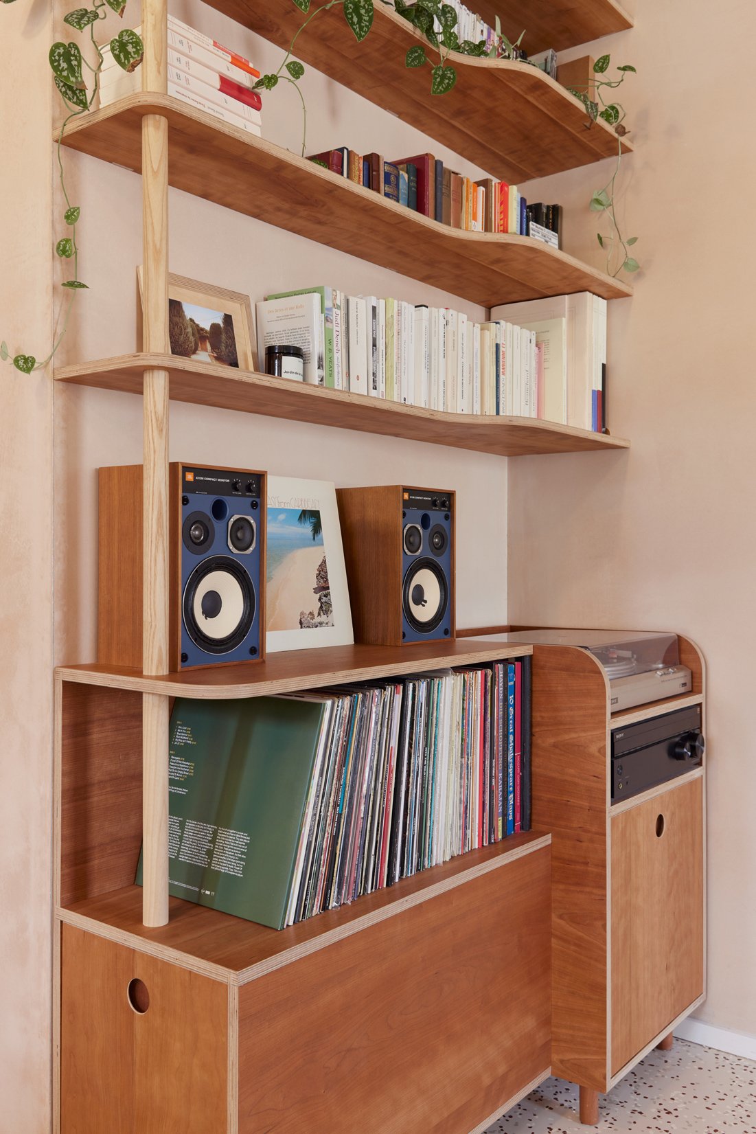
The lower cupboard of the unit rests against an electrical outlet, so we took the opportunity to carve a space around the socket with guiding lines for the wires. This makes access a breeze and keeps the cupboard functional and tidy.
As well as open shelving, Soroush and Barbara needed enclosed storage for tucking away their lesser-used belongings, such as paperwork. The base of the unit features a large drawer with runners that allow for up to 100 kg of items to be hidden away. The drawer is pulled out from the side, so as not to encroach on the dining area.



After creating our bio-resin surface in 2018, Soroush wanted to test first-hand the longevity of the finish so built his own Wave Table. Together with Barbara, they’ve been using the table for five years (three years in their previous home) and it still feels brand new. The piece slots perfectly in the dining area of their Hide apartment matched with two of our Wave Benches.


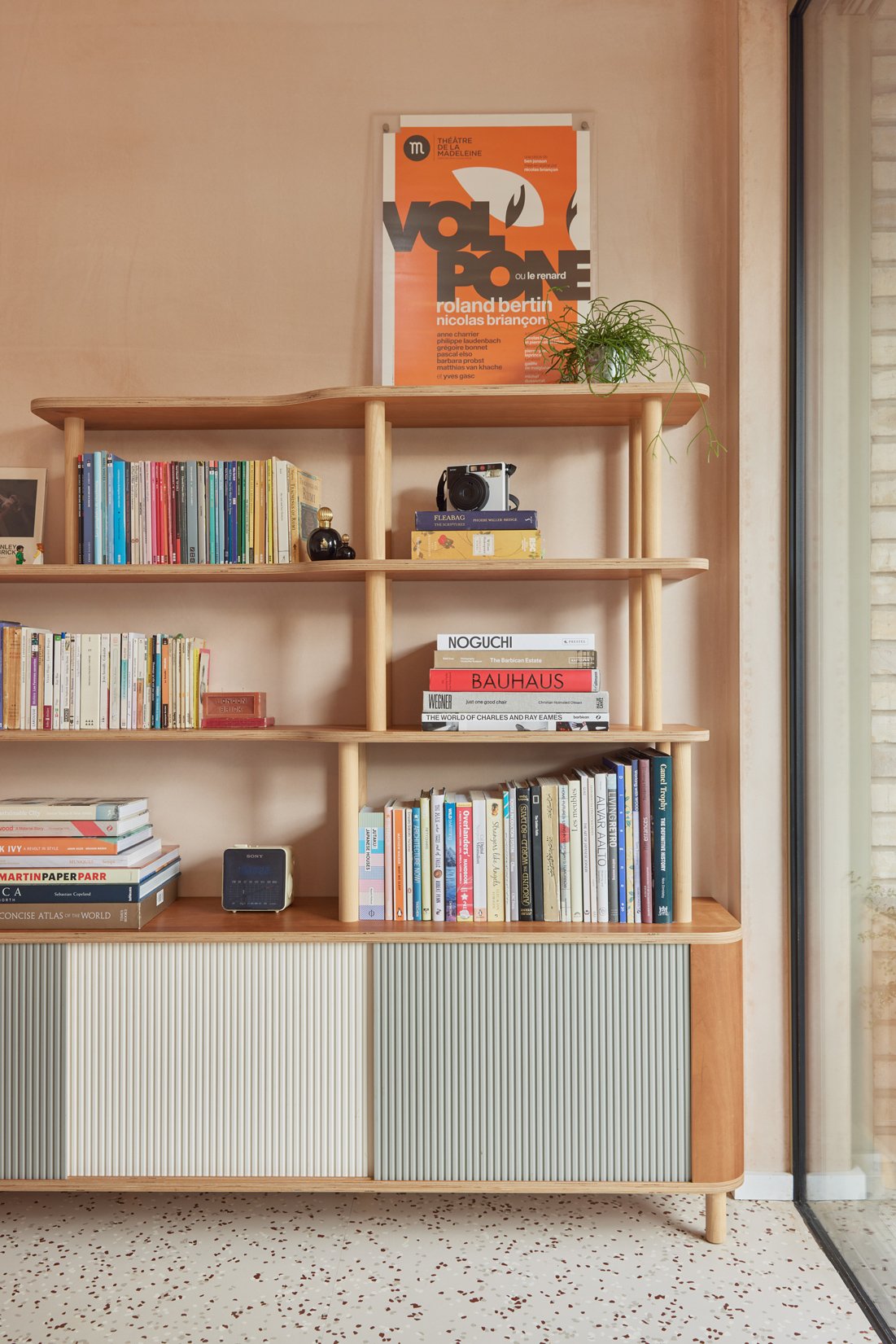
In the living area, Barbara and Soroush were after a sideboard and shelving unit to house more of their beloved books, art and ornaments. With Barbara being an actor working between Paris and London, she has a vast collection of screenplays and art books. And Soroush has a similar number of design volumes.
Taking influence from the record player unit in the dining room, we once again worked with different shelving depths to reduce the furniture’s bulk. Rounded corners on both the shelves and the sideboard hark back to the curves of the kitchen, all tied together with our signature corrugated plywood doors.


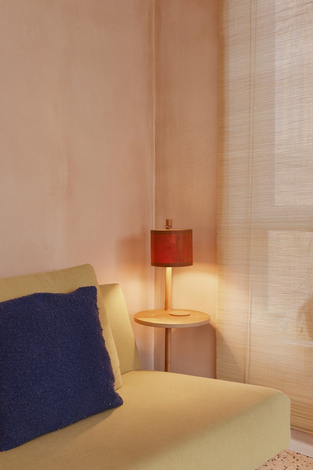
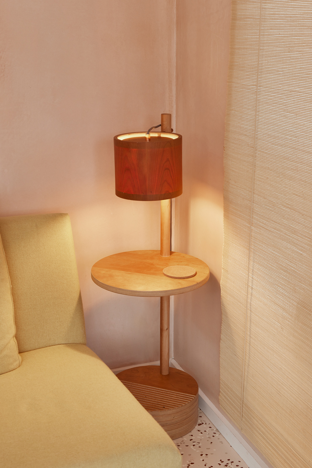
For their previous home, Soroush had designed a combination of a lamp and a side table as a birthday present for Barbara. Luckily he’d chosen to make the piece in our cherry wood veneer, meaning it fits their new space perfectly. A very happy accident that completes the living area.
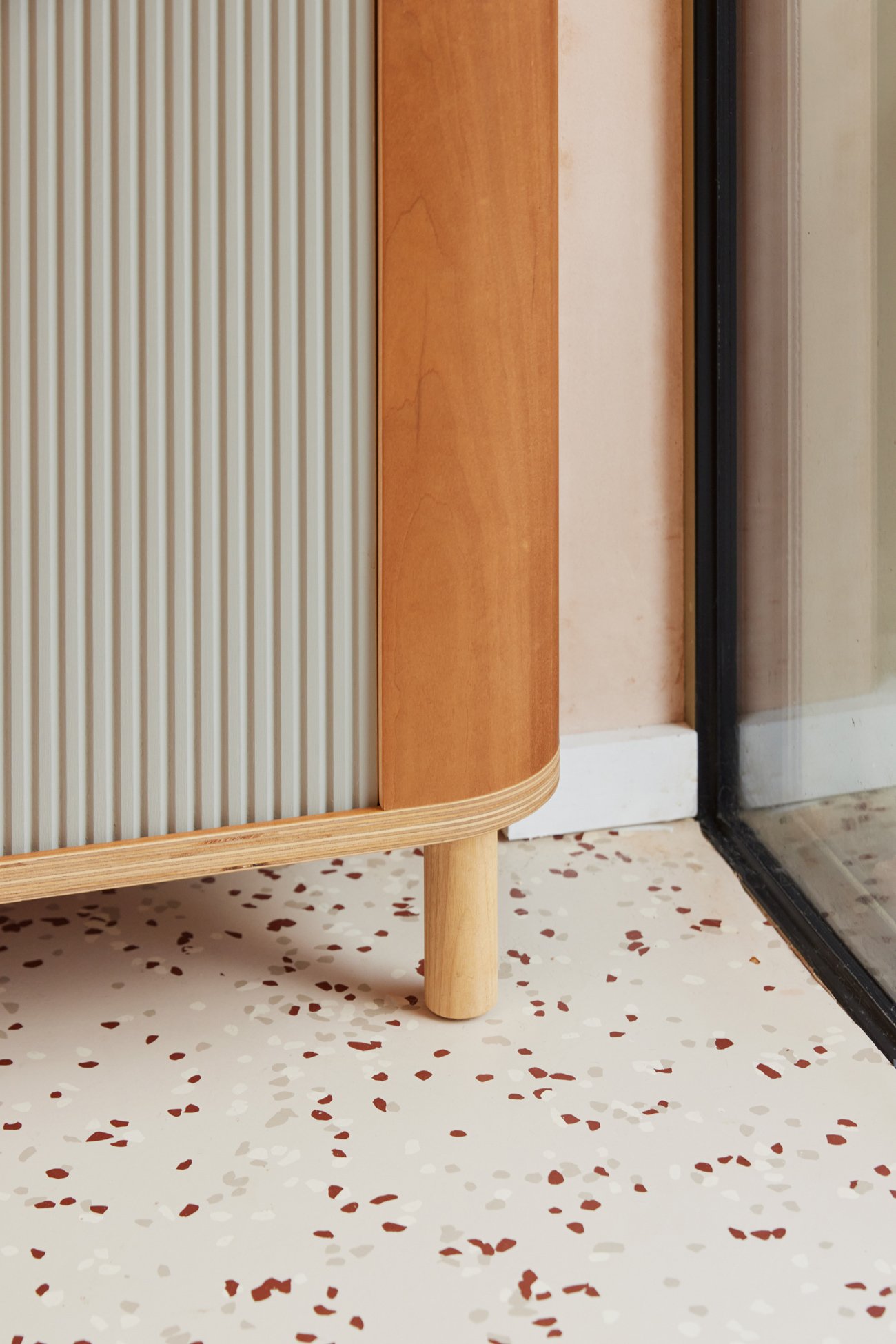
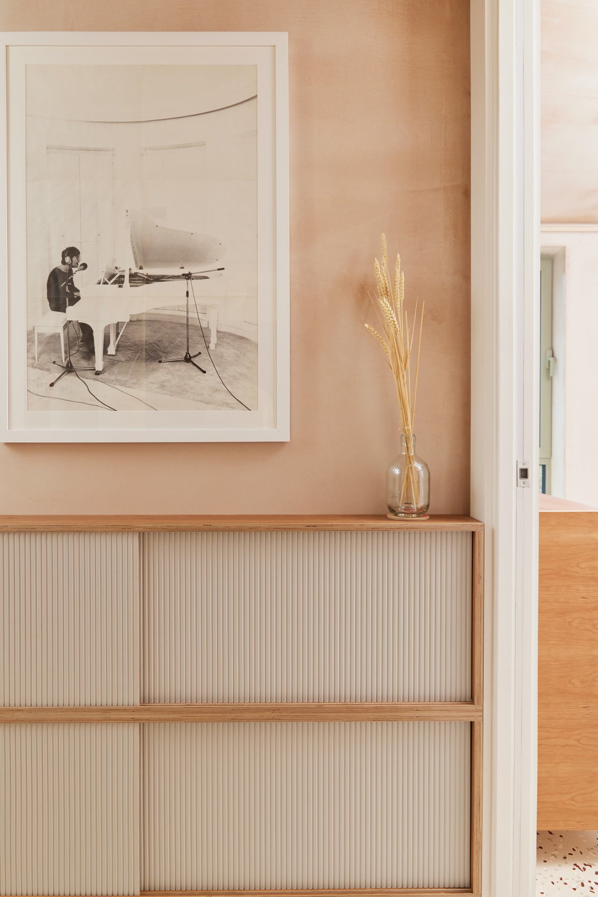
In a bid to make the best use of the space, Soroush felt that a thin gap opposite the front door had the potential to become shoe storage. The depth was just enough to house the footwear behind a sliding door, with room on top to place your keys as you return home. To us, this piece of furniture represents what we do at Lozi. With a dose of imagination, we’ve been able to take what feels like a wasted space and turn it into something functional and tidy.
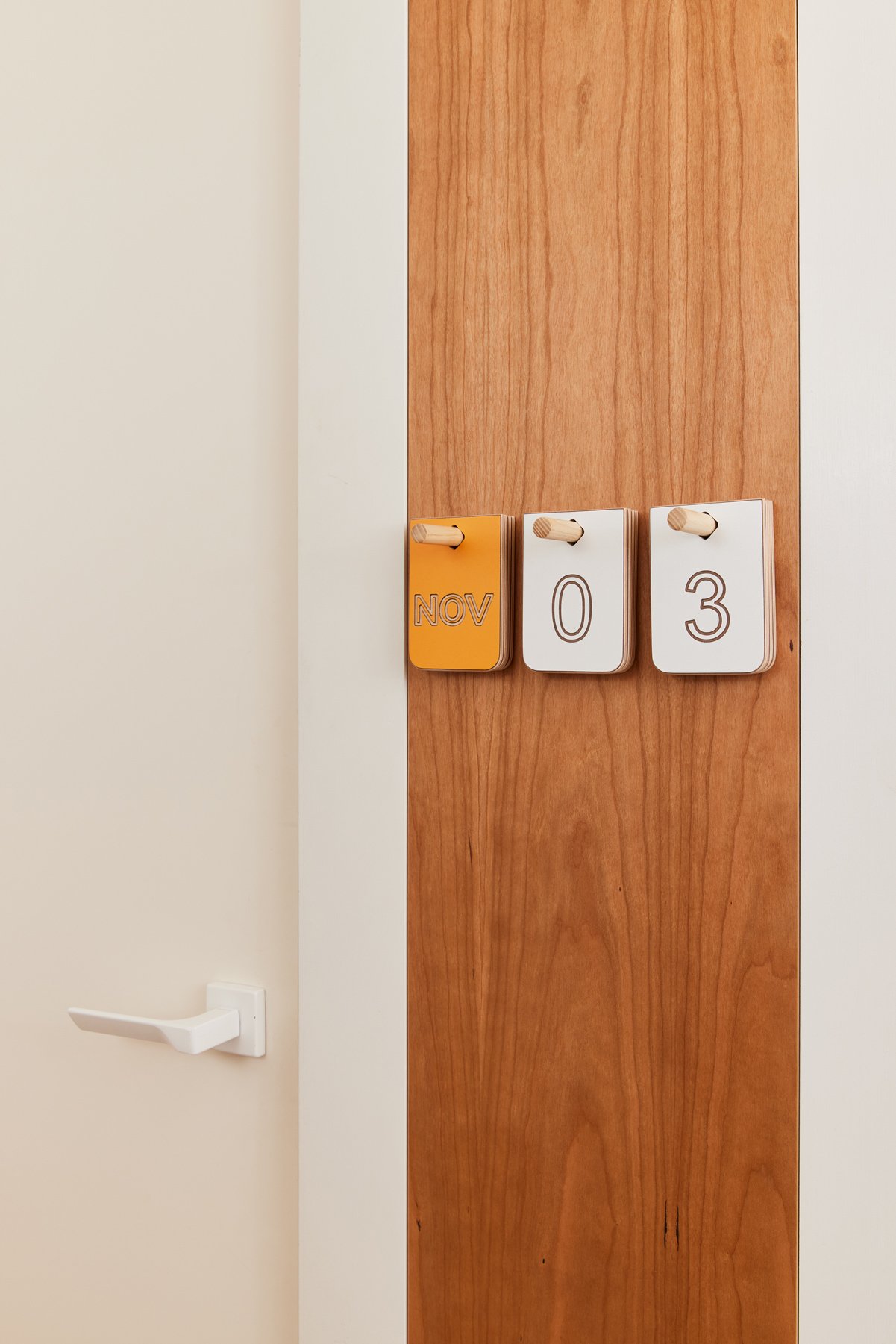
On another sliver of wall in the hallway, Soroush chose to add a plywood panel covered in cherry veneer with the addition of our Moritse Board calendar. Once again, making use of an unused few centimetres.


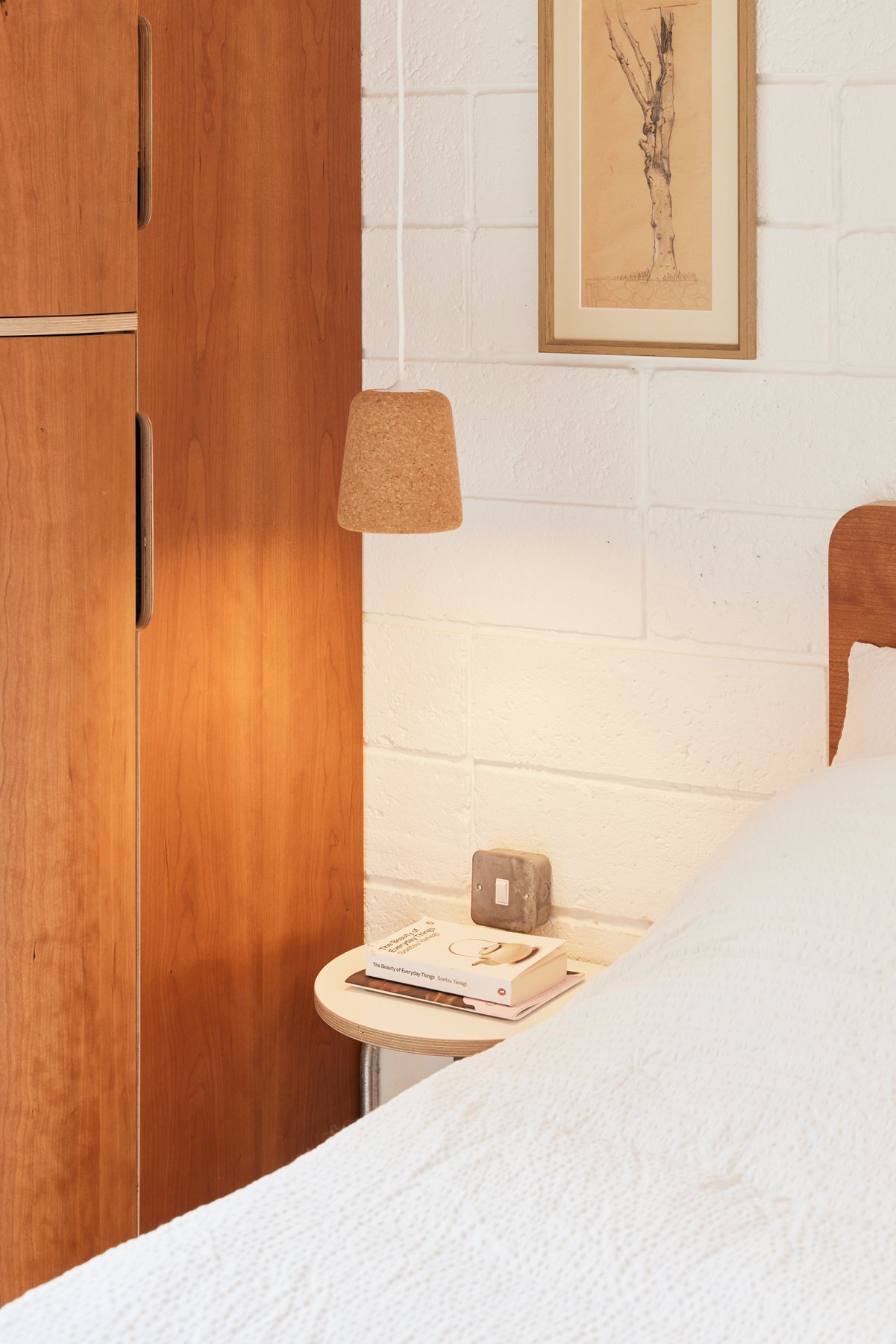
In the bedroom, Barbara and Soroush needed more hanging space. We created a curved-door wardrobe, similar to others we’d created in the development, with two levels of rails. Autumn and winter clothes now sit at the bottom, with spring and summer pieces at the top. The wardrobe slots seamlessly into the corner of the room, alongside our Bed and a bespoke bedside table.

At the end of the bed, Soroush was keen to add a chest of drawers that felt harmonious with the rest of the apartment. He once again didn’t want the piece to feel bulky, taking into account it would be their first view each morning.
Inspired by writing desks, we created a piano-hinged lid that curves just like the wardrobe, with corrugated doors also seen in the hallway and living area. The concept for the top section was to house everyday items that Soroush needs to access quickly - his phone, watch and camera - with space for him to store the clothes he’d like to wear tomorrow.
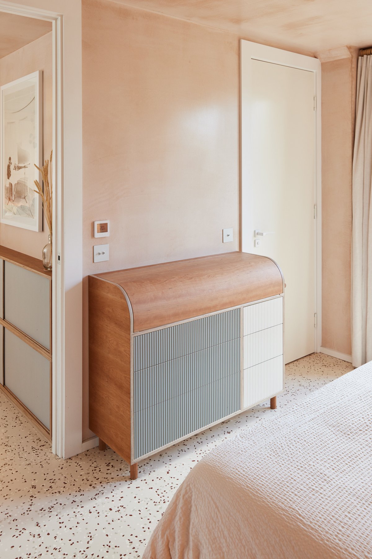

As the drawer unit sits next to the ensuite bathroom, a small rail on the end acts as an ideal spot to hang clothing while showering so that it doesn’t crease. In the bathroom itself, we worked with the size and shape of the terracotta tiles to create a storage cabinet. Handy doors keep the space minimal and tidy, with room above and below to display items too.


While the Hide project overall meant a huge amount to Lozi, it means even more now that our founder Soroush and his wife Barbara have made it their home. A true House of Lozi project, with bespoke pieces running throughout, their apartment showcases what our ethos is all about; designing furniture that works for you and your lifestyle, making the best use of space and, we hope, creating something beautiful.
-
Please find our guided pricing here
Each project varies depending on the size of your home, the complexity of the design and your choice of materials and finishes.
-
Kitchen: all cabinets and worktop
Wardrobes: curved corner + alcove wardrobe
King size bed
Chest of drawers
Bathroom cabinet
Sideboard + shelves
Corner media unit: record player + shelves
Entrance way shoe storage
Lamp/side table in the living room
-
Sink | appliances | electrics | plumbing | any other home accessories shown
-
After submitting your enquiry and confirming a quote that suits your budget, you'll be allocated one of our highly skilled designer-makers and they will schedule a site visit, where relevant. Based on your requirements and personal style, we'll provide a digital 2-D design to visualise the project outcome. Your designer-maker will ensure the experience is stress-free, supporting important design decisions and providing tailored, design-led solutions. All Lozi furniture is then made in-house and if appropriate, carefully installed by the designer-maker and workshop team.
Click here for a full breakdown of each stage.


