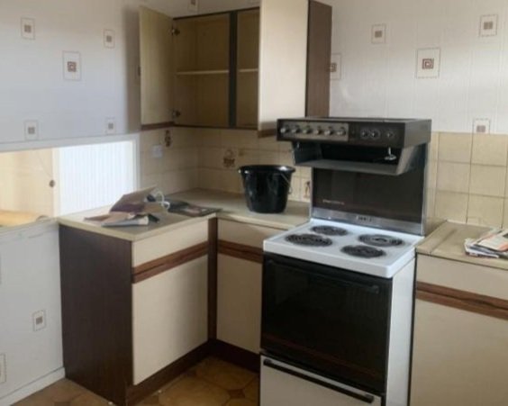
In 2018, Lozi client Glen bought a split-level apartment in the heart of East London, with the intention of transforming it into his dream home. Taking inspiration from iconic mid-century design, his Filipino roots and his love of natural materials, Glen set about rebuilding the space from top to bottom.
In keeping with the vibe of the house, we created a kitchen unlike any we had built before. Celebrating classic design while simultaneously bringing the space firmly into the 21st century, we designed something as unique as Glen himself. Meanwhile upstairs we helped to turn the dingy bathroom into a luxurious spa-like retreat, using cabinetry and shelving to add practical personality.
When Glen first purchased this maisonette, it’s safe to say it was in serious need of some love. Not much had changed since the previous owner had decorated in the 1970s, and much of the original décor remained. It required a true visionary to look past its dated exterior and imagine what it could be when shown the right care and attention. An open mind and good visualisation are key components of a successful transformation.
The first task at hand was to gut the space. Emptying out old appliances, dated wallpaper and vintage cabinetry left a blank canvas ready for Glen to put his stamp on. It even exposed some hidden gems, such as the original copper pipes which would later become a celebrated feature of the final design.
The serving hatch was a classic trope of 1970s design, and although it allowed some light in, it blocked the space off from the newly installed French doors which spanned the length of the living room, as well as annexing off the kitchen from the new dining area that Glen had in mind. To solve this, Glen decided to remove the entire wall (with the help of a structural engineer), opening up the room and allowing it to flow all the way from the front to the back of the house.
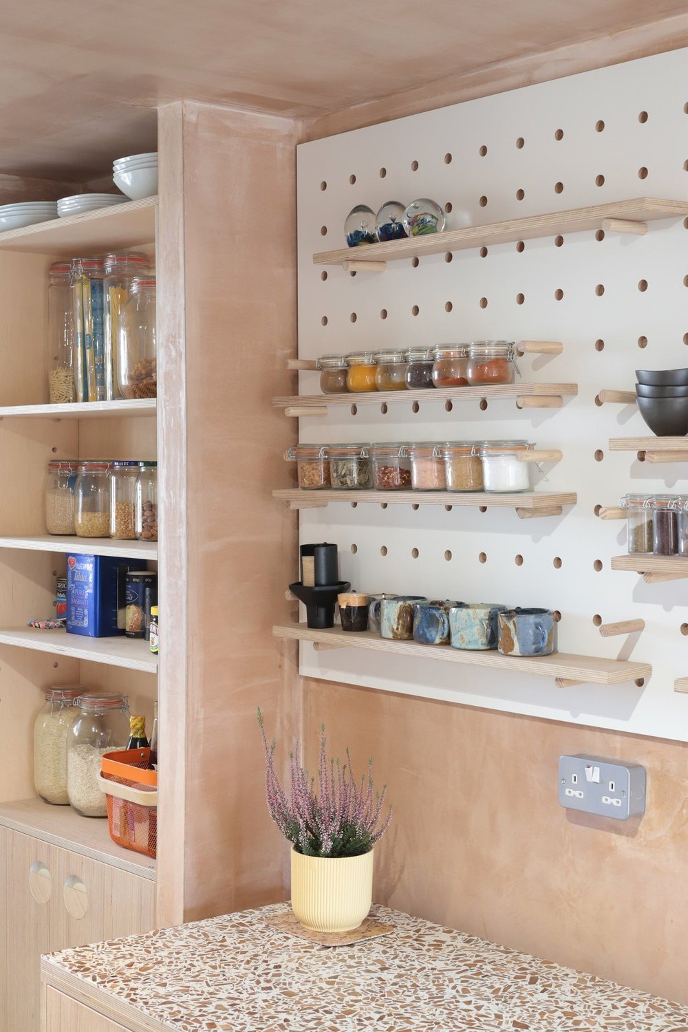
One of the key design details Glen wanted to include was in fact inspired by another Lozi project - Hide. Having followed Lozi’s work for a long time, Glen had fallen in love with the raw pink plastering technique when he had seen it on social media, featured throughout our new build project designed and built with Artform & Scenesmith.
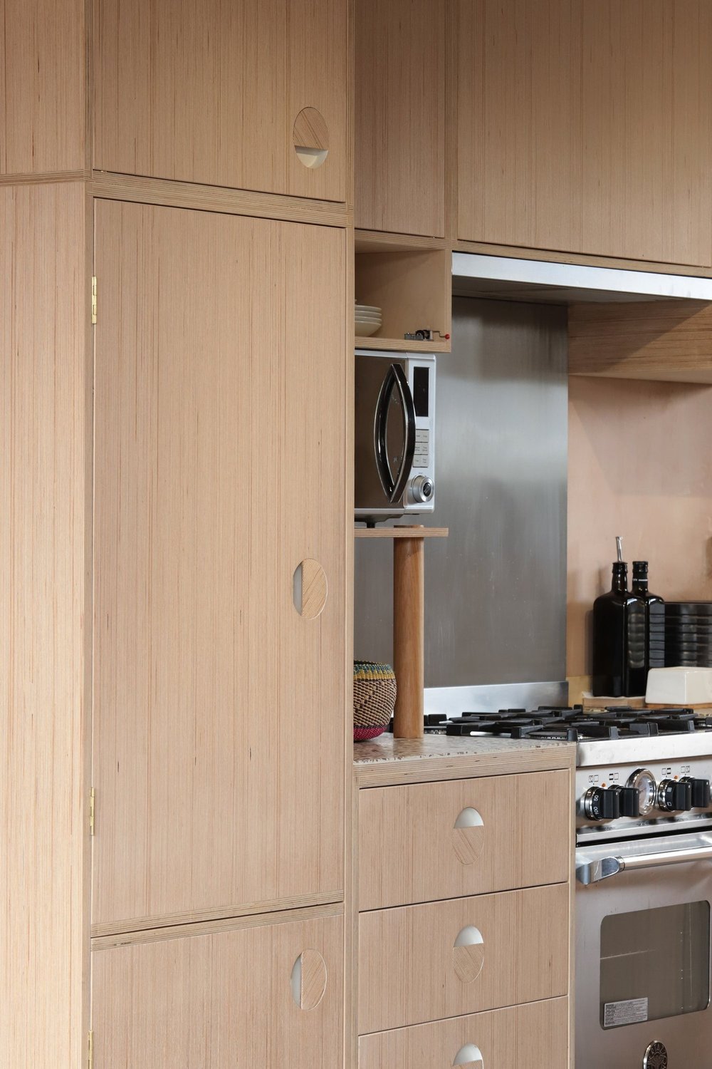
When we first met with Glen to discuss the what he was looking for in the space, we were immediately excited by his response. The key word was unique, and we had just the finish in mind. We had been wanting to design a project that centred Birch Edge Grain on a larger scale and this was just the place to do it. Luckily Glen loved the idea as much as we did and was completely on board. We combined this with a beautiful sustainable wood chip ‘terrazzo’ surface from Foresso, creating a textural and entirely unique space, unlike any we had seen before.
On top of this Glen was looking for some clever storage solutions, and as a budding home chef, he was particularly keen on maximising the surface area. The difficulty was delivering this without compromising on space and making the room feel cramped. Our solution? A fully mobile island, featuring full-size cupboards, and integrated bin, and built to match the rest of the finishes - inspired again by the mobile island in our Hide flat. It can be pushed against the wall when not in use, and then easily wheeled out to create a peninsula-style design, perfect for when you are cooking while chatting to guests.
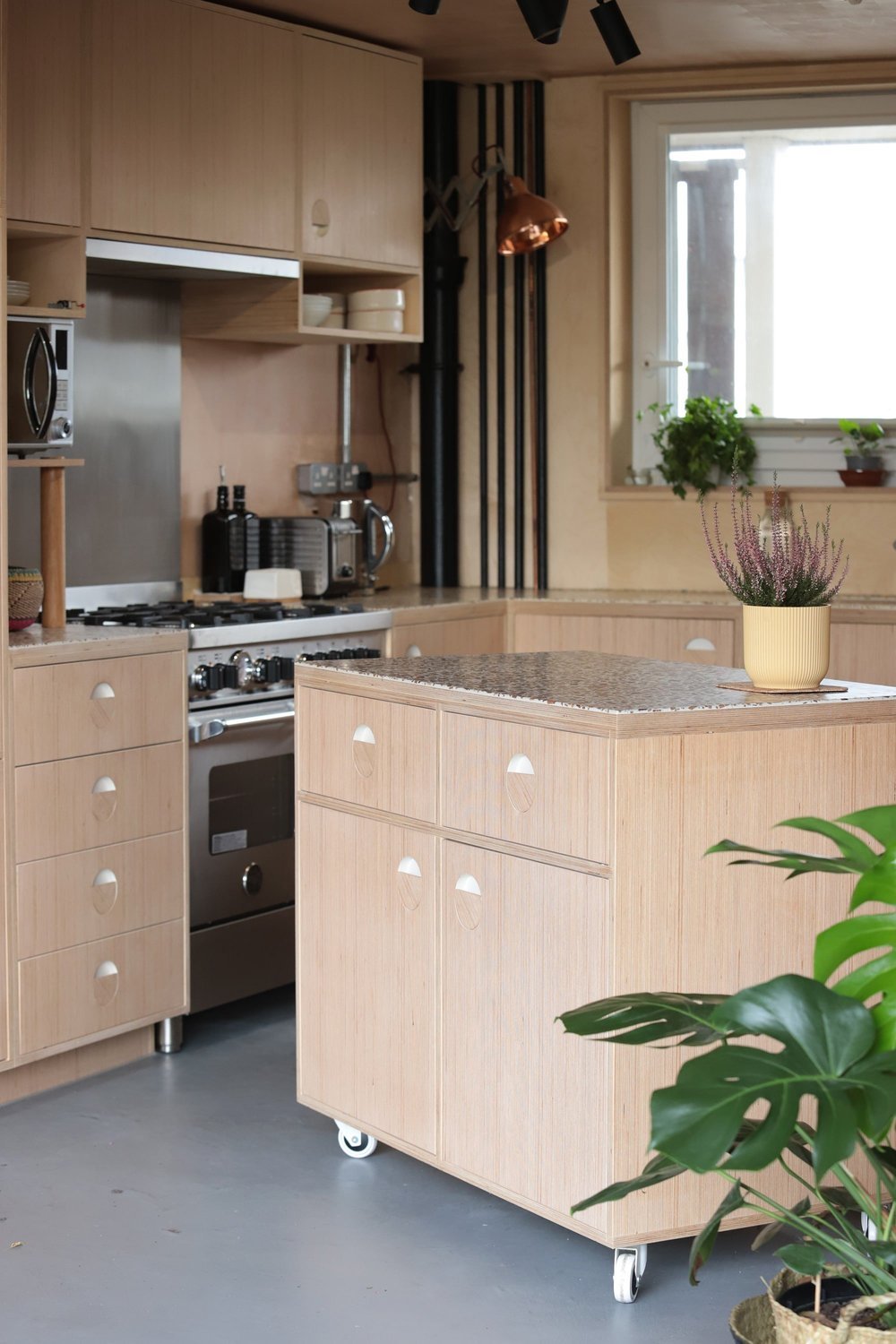
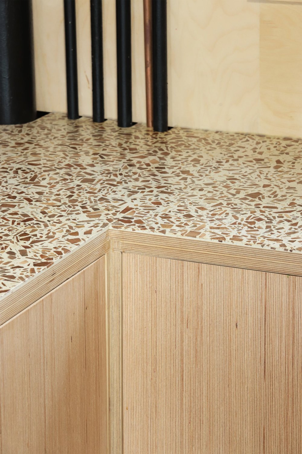
One clever feature wasn’t enough, at Lozi we are always hungry for a challenge. When Glen mentioned how much he liked the look of the copper pipes he had discovered during the earlier stages of the build, it seemed wrong to box them or hide them away, and together we decided to make a feature of them instead. We used a specially devised Lozi method to map the location of all of the pipes and then used these to custom cut the Foresso surfaces exactly to spec, so that they would sit snuggly around the pipes.
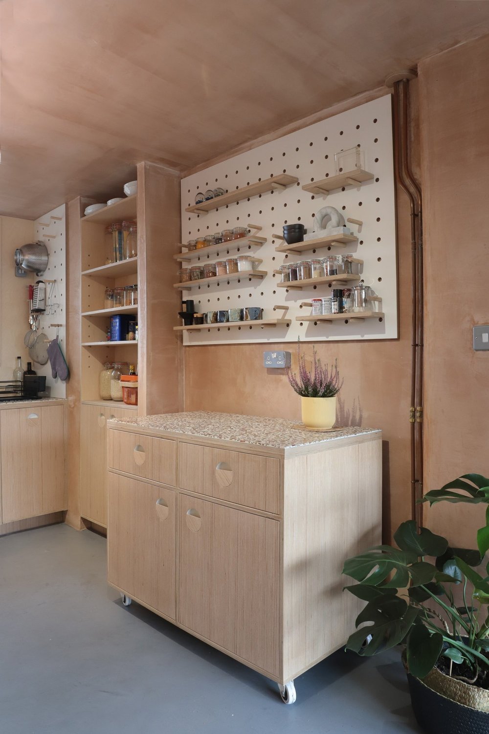
Storage is always at the forefront of everyone’s mind when designing, particularly in a kitchen environment. But it can be all the more tricky when you are working with a narrower space. We wanted to find a way of adding flexible storage that wouldn’t protrude into the room too much, but would still be useful (and not too pokey). This reimagining of our classic Peg Board is a fun and playful way to add storage to the space, and it can be configured in whatever way suits you - changing as you need it to.
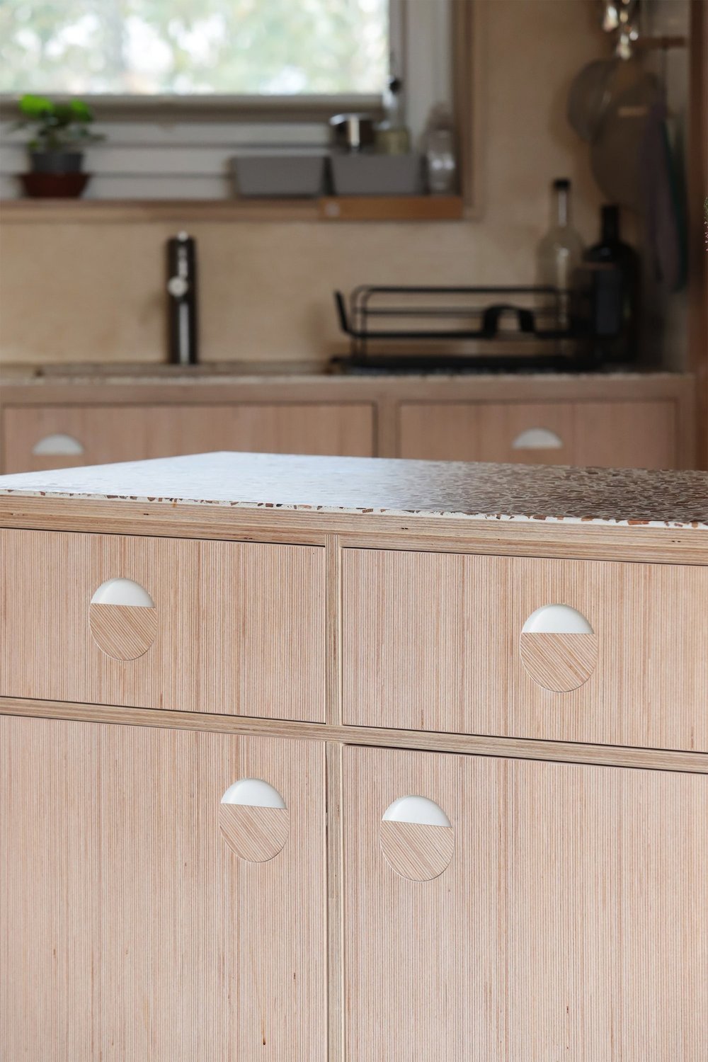
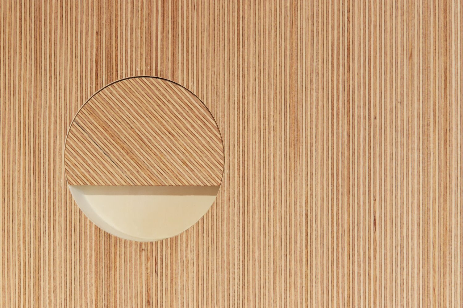
As we were working with Birch Edge Grain, we wanted to make sure we were celebrating this unique pattern at every possible opportunity and so we devised this original handle design. By angling the Birch Edge Grain on the handles slightly, it created a contrast between the handles and the surfaces of the door, which is both subtle and elegant, and yet eye-catching.

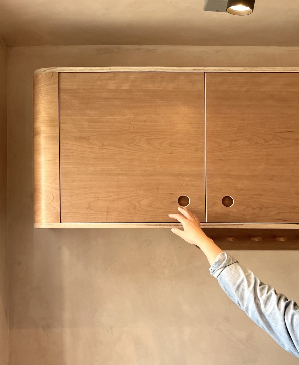
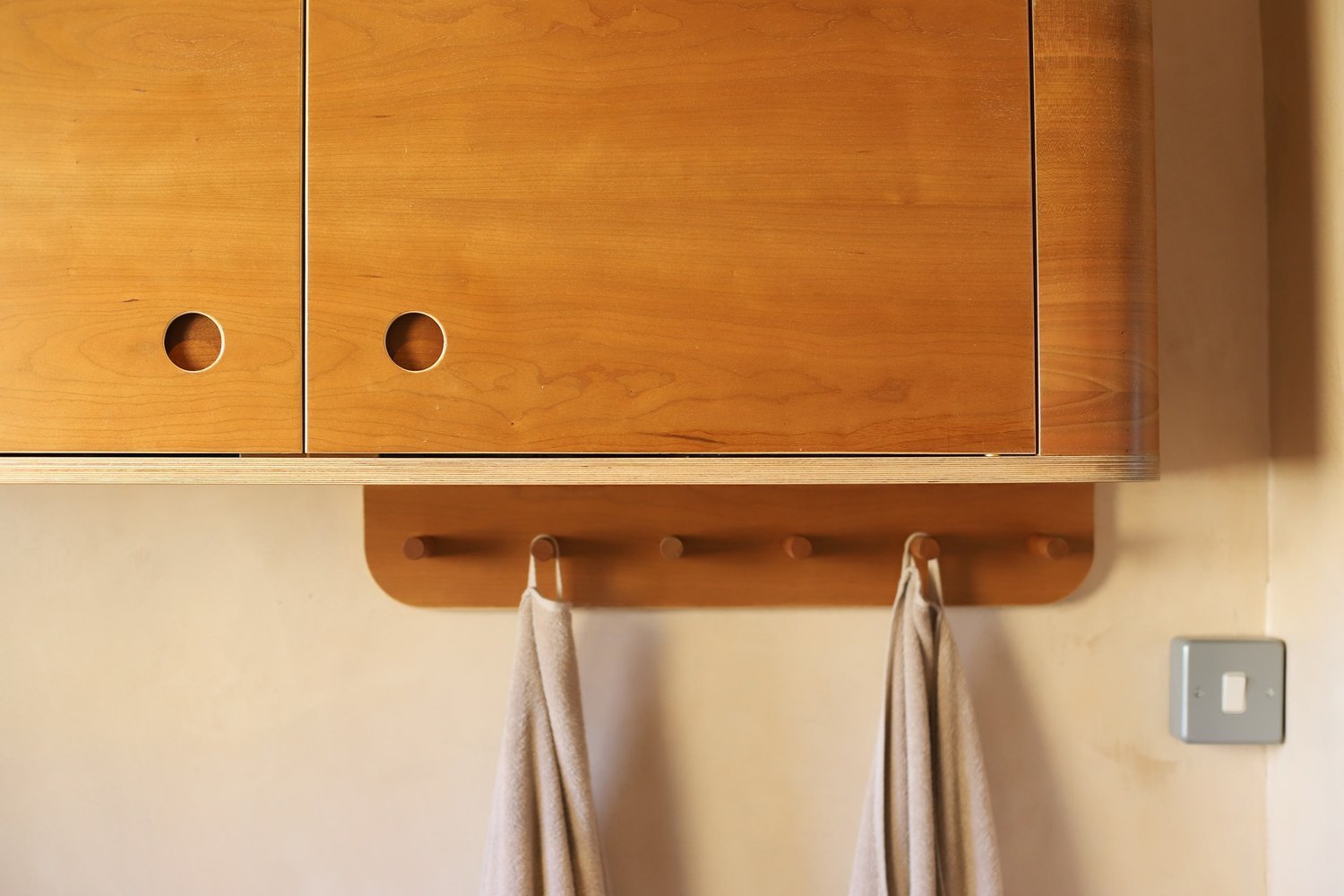
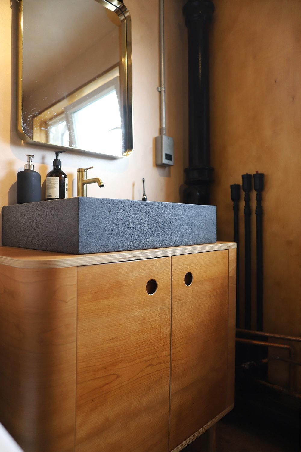
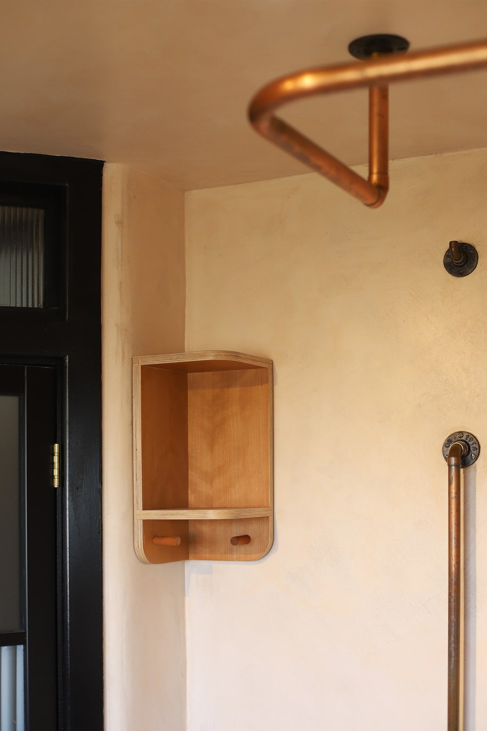
The idea with the bathroom was to create a luxurious retreat, in keeping with the mid-century feel of the house, and interchanging the old bath for a contemporary deep, square tub, which created more space in the room. The charcoal grey finishes, along with the copper hardware seemed destined to be united with the rich tones of luxurious Cherry hardwood veneer.
Classic Lozi curves soften the space while ample cupboard space provides much-needed storage. Clever corner shelving is the perfect spot for shower items, while pegs beneath the cupboard and shelving echo the design of the pegboard downstairs, uniting the design throughout the house.
-
Please find our guided pricing here
Each project varies depending on the size of your home, the complexity of the design and your choice of materials and finishes.
-
Kitchen: Full fitted kitchen in Birch Edge Grain finish with mobile island, featuring full size cupboards.
Bathroom: Vanity unit, curved cupboard storage, corner shelf and hooks.
-
Appliances, sink, plumbing/gas installation and all other furniture and decorative objects.
-
After submitting your enquiry and confirming a quote that suits your budget, you'll be allocated one of our highly skilled designer-makers and they will schedule a site visit, where relevant. Based on your requirements and personal style, we'll provide a digital 2-D design to visualise the project outcome. Your designer-maker will ensure the experience is stress-free, supporting important design decisions and providing tailored, design-led solutions. All Lozi furniture is then made in-house and if appropriate, carefully installed by the designer-maker and workshop team.
Click here for a full breakdown of each stage.


